
On April 21, 2015, Google released a significant new mobile-friendly ranking algorithm that’s designed to give a boost to mobile-friendly pages in Google’s mobile search results. The change is so significant that the date it happened is being referred to by a variety of names. Sometimes it’s also referred to as mobilepocalyse, mopocalypse or mobocalypse or mobilegeddon.
One of the best ways to prepare is to test that Google considers your web pages to be mobile-friendly by using its Mobile-Friendly Test tool. More about the algorithm, including ways to bring improve the mobile-friendliness of your pages, is below.
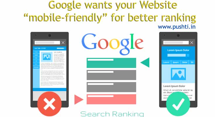
Mobile is changing the world. Today, everyone has smartphones with them, constantly communicating and looking for information. In many countries, the number of smartphones has surpassed the number of personal computers; having a mobile-friendly website has become a critical part of having an online presence.
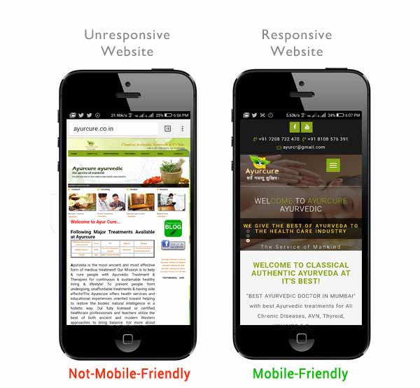
A mobile friendly website is essentially when your regular website shrinks down to be small enough to display on a mobile device. It looks like a tiny version of your website. There’s a lot of zooming, pinching and scrolling going on, but the site displays and functions.
We all know the Google mobile-first index is coming soon, probably in the next few months or so. To prepare, it seems Google is encouraging webmasters to go responsive with their websites.
Google has just published a how-to on moving your m-dot site to responsive. The techniques are pretty basic, but it is an excellent reminder that while Google supports many mobile implementations, they do recommend responsive. In fact, Google has recommended that if you are switching to responsive, do it before the mobile first roll out.
A webpage is eligible for the “mobile-friendly” label if it meets the following criteria, as detected in real time by Googlebot:
- Avoids software that is not common on mobile devices, like Flash
- Uses text that is readable without zooming
- Sizes content to the screen so users don’t have to scroll horizontally or zoom
- Places links far enough apart so that the correct one can be easily tapped
1. Why make a website mobile-friendly?
The desktop version of a site might be difficult to view and use on a mobile device. The version that’s not mobile-friendly requires the user to pinch or zoom in order to read the content. Users find this a frustrating experience and are likely to abandon the site. Alternatively, the mobile-friendly version is readable and immediately usable.
2. What is Google’s goal with all of these mobile-friendly changes?

There are obviously a lot of goals in the mix here, but we do believe that Google is making these changes primarily to provide a better mobile experience for searchers, and give people exactly what they want. That said though, they are also in it to make money. Being able to easily surface apps in a search result will help them drive more and better app development for Google Play and monetize their other content like TV shows, books, magazines, movies, and music-all of which have been threatened recently by competitors like Hulu, Amazon, and of course iOS App Store and iTunes.
Google has been encouraging publishers to include transcripts with videos and song lyrics with songs. In the long run, those will help Google scrape and show those things in answer boxes, as shown at the right, but eventually they will probably also surface their own version of the content from Google Play, with links just below the answer box, so that you can watch the video or download the song directly to your phone on Google Play. When you think about Google’s intentions on this front, and try to envision the future, it is important to note that Google is actually already offering Google Play for iOS, which currently just provides the Google Music cloud-storage and a music subscription model. We expect this to expand as well, so that Google can expand their level of competitiveness here too.
3. If my site is not mobile-friendly, will this impact my desktop rankings as well?
On a panel at SMX Munich (2 weeks after SMX West) Zineb from Google answered ‘no’ without hesitation. We took this as another indication that the new index is related to a new crawler and/or a major change to the infrastructure they are using to parse, index, and evaluate mobile search results but not desktop results. That said, you should probably take some time soon to make sure that your site works-at least in a passable way-on mobile devices, just in case there are eventual desktop repercussions (and because this is a user experience best practice that can lead to other improvements that are still desktop ranking factors, such as decreasing your bounce rate).
4. How do I know if my site meets Google’s requirements for mobile friendliness?
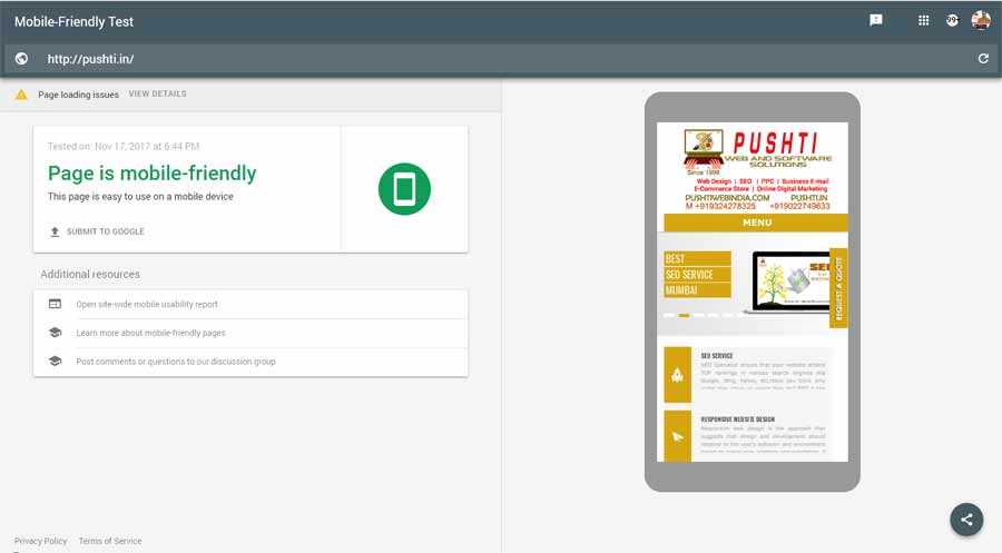
Google has created a Mobile-Friendliness tool that will give you a ‘yes’ or ‘no’ answer on a per-url basis. Pages are evaluated individually, so another quick way to get a sense for how your top pages perform is to do a “site:” query for the domain in question on your phone. That will allow you to see all the pages indexed to the domain, and evaluate which ones are considered Mobile-Friendly and which are not, without having to submit them to the tool one at a time.
5. How do you make your website mobile friendly?
- Create a Mobile Version of Your Current Site. The quickest way to make your site mobile-friendly is to create a mobile version of your desktop site using a conversion platform like bMobilized or Duda Mobile.
- Use Mobile Plugins on Popular CMS Platforms.
- Use a Mobile-first Responsive Design.
6. What about sites that redirect to a mobile subdomain? Will they be considered mobile-friendly?
This is an interesting question, because immediately after the roll-out of the Mobile-Friendly tagging, we actually saw significantly more mDot (‘m.’) websites ranking well in the mobile SERPS. It’s almost like they counted the mobile subdomain as a Mobile-Friendly signal, but started the algorithm fresh, with no historical data to indicate which other sites had fewer obvious signals of mobility, like a responsive design, or an adaptive or dynamically served mobile site. It is also interesting to note that many of the Google representatives seem to have recently backed off of their strong insistence on responsive design. They still say that it is the least error-prone, and easiest to crawl and index, but they also now seem to be more willing to acknowledge the other viable mobile site architectures.
7. Employing a responsive web design approach can provide you with the following benefits:
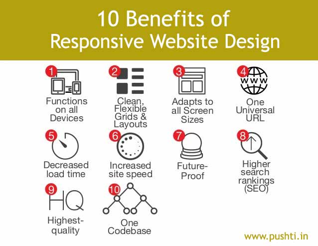
- More sales: Mobile sites can help lead to more mobile purchases. In fact, companies incorporating responsive design typically see increased conversion rates than those that don’t.
- Brand reinforcement: Consumers want an easy, seamless experience on your site. A frustrating mobile experience can create a negative image of you and your company.
- Cost savings: Responsive web design can eliminate additional time and money managing a website and a mobile site.
- Good for SEO: Search engine giants Google and Bing favor responsive sites, which can help with higher ranking on search result pages.
8. Google’s mobile-first index has rolled out for some sites & will be implemented very slowly.
Gary Illyes from Google would not give us any timelines, but the rollout of the mobile-first index is going well, and a blog post about the process should be out soon.
The mobile-first index has started to slowly roll out, at least for a “few sites,” Google Webmaster Trends Analyst Gary Illyes told an audience last night at the SMX East conference in New York City.
It is unclear how many sites have already switched over to the mobile-first indexing process, but, when I asked Illyes to clarify what he meant by “a few sites,” he said a few relative to the Google index. So that could be quite a large number of websites.
He said there is no reason to panic about the rollout because Google is still testing it and will be rolling it out incredibly slowly. He added that there is no foreseeable time when the mobile-first index will be fully implemented.
The admission came as a surprise as we did not expect the rollout to begin until next year, but it seems positive test results have encouraged Google to move forward.
In selecting sites to be switched over, Google has set up “classifiers” to define how ready a site is for the mobile-first index. Classifiers determine how equal or comparable the desktop site is to the mobile site when it comes to content, links, schema, multimedia, etc.
If the content, links, schema and so on all match at a 100 percent level, Google is more likely to take that site to the mobile-first indexing stage. If they are at an 80 percent level, Google might wait and communicate to the webmaster that there are specific changes that need to be made to the mobile site to get it closer to being 100 percent comparable.
In any event, Gary Illyes said the purpose of rolling it out to a limited number of sites is to test it more. The tests seem to be going very well, and it will gradually roll out to more sites over time. He said the rollout will go incredibly slowly, and Google will communicate the process to webmasters along the way.
Google also has a blog post in the works that will be published at some point helping webmasters and SEOs understand the process. The company won’t provide a timeline or ETA for the rollout or the blog post, but Illyes confirms they are on the way.
www.pushtiwebindia.com
www.pushti.in
www.incabrescia.com
www.seospecialistmumbai.com


